Being able to insert pictures in our blog posts is an essential first step to making an appealing presentation. Images along with valuable textual content will help you to keep the attention of the person that just clicked onto your page. Would you like to step up your game with the option to create other types of graphics that you could use on your pages? This post (and video tutorial) will show you that it is within your reach.
If you were a graphic designer, you would have expensive apps at your fingertips such as Photoshop or Adobe Illustrator. These apps cost hundreds of dollars and require extensive training to effectively use. In this lesson, I will show you (Mr./Ms. Blogger) that you can do some very useful basic graphic composition tasks. You, in fact, won’t need to spend a dime because there are free tools that are now available to us on the web. The free apps aren’t as sophisticated as the paid ones but when we are through you’ll be amazed at how much you are able to do.
Our session will focus on a practical first use of your new found graphic skills: let’s design a banner for the top of our blog signature. In the new ActiveRain blog styling, there is a text banner that says “POSTED BY”. Let’s create an eye-appealing answer to that question. We will compose several elements into a single graphic that you can insert into your signature block. 1) your name 2) a tagline 3) your phone number 4) your email address 5) your photo 6) a background image
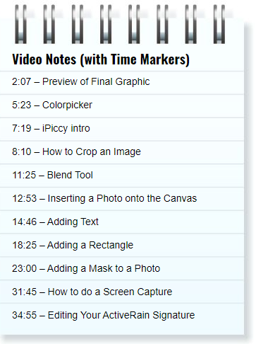
Here is the Tech Tutor video that will take you step by step through the process. Below the video is a narrative of the things that you will learn and will be a good reminders list for you after you have watched the video.
Recommendation: Watch video in full screen mode to better see the details. After the video starts, the full screen button will be in the lower right corner of the video frame.
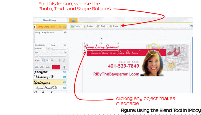
The free image editing tool that I’m recommending today is at ipiccy.com. We will be using Ginny Gorman as an actual example so you can see real world application. Ginny has a great illustration created by fellow-AR Ellen Caruso which shows a famous pair of Ruby Slippers and an catchy tagline of “because there is no place like home”. The first thing I will demonstrate in the video is how to use the crop tool in iPiccy. We don’t have enough space for the entire illustration in this context so we will crop to the essential elements of the shoes and the wand.
To create a graphic, or composition, we start with a blank canvas. In the case of the new ActiveRain design, we have 700 pixels to work with in the main body of our post. However, the signature block is “padded” with extra margin giving us 680 pixels of maximum width.
The tool we move onto in iPiccy is called the Blend tool. It will ask us for a canvas size. Let’s use 680 pixels wide and 400 pixels of height. As you will see, 400 is more height than we actually need but we crop off the extra white space when through. It gives us room to work.
We need to insert the elements that are photos. These will be uploaded to your sidebar “tray” and then you drag and drop them onto the canvas. Objects in iPiccy can be both moved and resized. When you are resizing a photo, ALWAYS do so by one of the four corners. Never use the edges as it will disproportionately stretch your photo.
iPiccy text tool will let you put text objects on the canvas. On the sidebar, you can choose different fonts and colors. Drag to move the text around and place it exactly where you want. Size it by the four corners.
If you right click (control-click, mac) on an object, you will see an options menu. One of the items that is useful with text is “duplicate” as you get another text object with the same font, size, color options and it will save you some time.
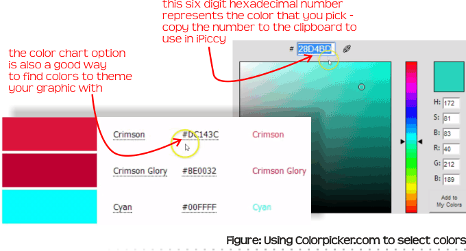
When it comes to having a color theme for a graphic, there is a useful site to note: colorpicker.com. On this site you have a tool to slide a pointer around a color selector box to find a color you like. At the bottom of the page, there is also a useful link called “color chart” where it has a very long list of predefined colors and names. In web and graphic design, colors are represented by an RGB value number (RedGreenBlue). This RGB number is represented in a six digit hexadecimal number like DC143C in the case of Crimson. You can select the six digit number in colorpicker and copy it to the clipboard. Then in iPiccy, with any selected object, paste the color number in the sidebar where it shows a color swatch.
In our graphic, we will be using a color rectangular box as a background for the tagline. The rectangle will stretch across the width of the canvas and will stitch our various elements together. The text on top of the crimson rectangle will be white. We will use the shapes tool button which will open up a secondary screen. At the top of this screen is a pull down list with preset shapes like circle, star, and rectangle. Choose rectangle and you will see your shape appear. Click done on the top button and it will drop a rectangle onto our main canvas. Change the color of the rectangle using the color number saved on your clipboard. Change the position and size of the rectangle by selecting it and dragging it around and dragging the corners and edges to get the length and height we need.
Another concept we come across in graphic design is the order of objects. If something is “on top” of another thing it will obscure it. In the video you will see that by right clicking on the text object that is behind the rectangle, you can choose the option “send to front” which will make the text in front of the rectangle so that you can see it.
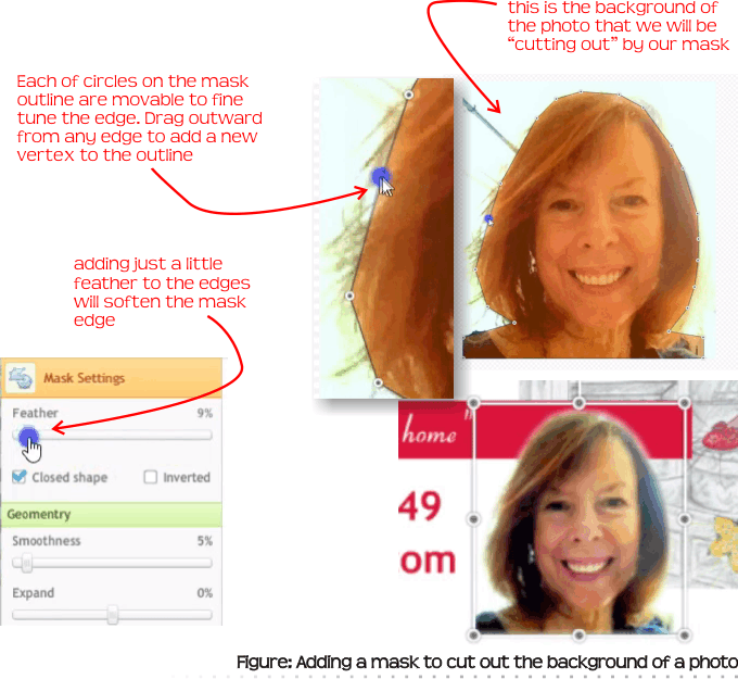
Next, we move on to a method of cutting out a portion of a photo. In Ginny’s portrait, we cut out the background by using a mask. In iPiccy, choose the photo and then go to the sidebar. Notice the option for “vector mask” which we turn on. There is a down arrow which makes a button visible to “edit mask”. A secondary screen will appear. There is a zoom slider at the bottom which makes the image larger and easier for us to edit. A mask is a series of points to make an enclosed boundary. The technique that I use is this: Go around first with a rough outline of points. Next, follow up with an editing round where you fine tune the points. Notice too, that as you hover over any edge, you can create a new vertex by dragging a point outward. You can add as many new vertices as you need to smooth the edge of the cut out. Finally, notice on the sidebar there is a feather option which will further soften the edges of your cut out shape. When you are through with the mask step, click done and you will notice the background of the photo has been cut out.
Once all the elements are finally on the canvas, you then have the steps of fine tuning. Drag the objects around to get them placed right and make fine tuning adjustments to the sizes of things as necessary.
Once everything is set, you could click done to lock them all in place. The next step would be to use the crop tool in iPiccy to crop off the extra bottom white space. Finally you would save your graphic to your hard drive.
There is just one little problem with these last couple of steps. In an iPiccy “blend” once you click done, you commit to locking in all the objects. If you later see something you want to tweak, you will be upset to discover that you no longer can edit the individual objects. You would have to start from scratch. My workaround for this is to do a screen capture of the composition. In Windows, you can use the snipping tool to do this. There is also a free app called Skitch that works both in Windows and Mac that does a great job at screen captures. In Mac you also have the option of Command+Shift+4 to draw a rectangular cutout box. By doing a screen capture, you can leave your iPiccy blend in “edit” mode just in case you want to make any more little adjustments.
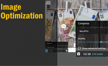
Finally, when you are saving your file you have the option of file type. JPG works best for photographs (the P in JPG is for ‘Photo’). Because of the algorithm in JPG compression, graphics that have few colors or with words on white background, the image saved will have lesser quality. For these types of graphics, the PNG (portable network graphic) format generally is a better choice.
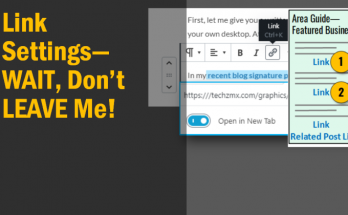
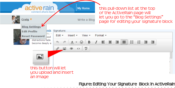
If you are using your newly created graphic as the start of your ActiveRain signature, you will need to go to the page where you can edit the signature of your blog. At the top left of the page where you see your photo (you have to be logged in), use the dropdown list to choose “Blog Settings.” From there you can edit your signature block. In this case you will use the button to insert image. You will upload the graphic file that you have just saved.
Creating a graphic to use as part of your blog signature is just one thing you can create now that you have an understanding of this set of online tools. Cover images for social media sites is another place where this knowledge will come in handy.
You’ll need to invest a little time to get the hang of using these tools but watch my video tutorial and you will see that you can do it! If you don’t have time right now, bookmark the page and come back to it on a stormy weekend day when you are stuck inside (in fact I’m watching the snow fall right now as I type this post!)