Images are very important to help your web pages engage your audience. The combination of informative text along with appropriate photos and illustrations is the formula for a captivating post.
Some of the biggest amateur mistakes of creating web pages is related to working with images. Doing it wrong will not “break” anything, but doing it right shows your expertise.
The ways to optimize images that you should be aware of are:
(1) file resolution/pixel size not exceeding actual page frame size
(2) file aspect ratio
(3) maximizing file type compression
(4) SEO optimization
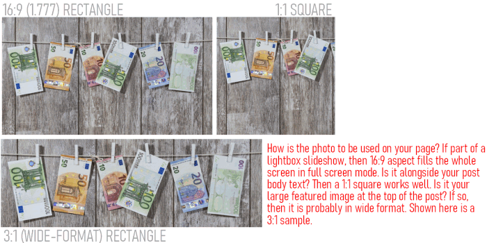
In this post, let’s talk about the first 3 ways noted above to optimize our images. To illustrate the process, let’s use this image from Pixabay
(h/t to Bruno /Germany from Pixabay – While pixabay allows free use of images without attribution, it is a courtesy to give attribution when you can so the site and their generous contributors get more visibility)
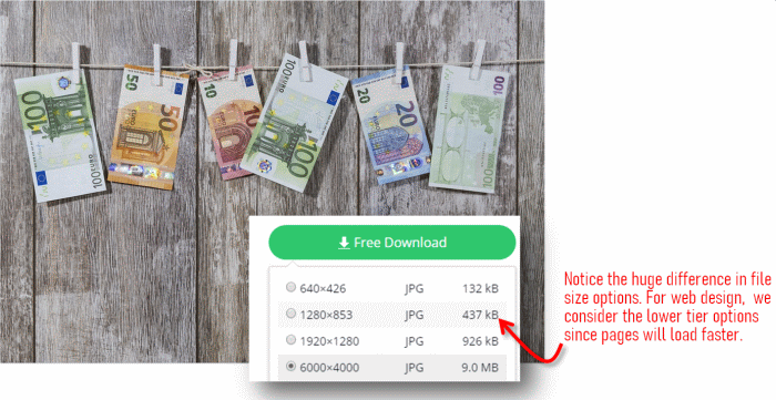
In the download options, notice how the resolution and the file sizes vary. Many desktops and laptops use screens with what is known as “Full HD” resolution. This means that they are 1920 pixels wide and 1080 pixels tall. Based on that information, any image with more pixels than that is just transmitting more data over the wires than is necessary. Larger files take longer to transmit.
This translates in longer page load times. This is both a negative user experience and can result in a lesser valuation in search engine page rank scoring.
Cropping your image to a specific use case will help reduce your file size. For instance, on many blog themes in wordpress, each post will have what is known as a featured image (also known as a “hero image”). Let’s say for instance that your theme has a 3:1 aspect ratio hero image (i.e. the width is 3 times more than the height). You should crop your image to match your target aspect ratio.
This has two advantages. First, your file size will be smaller (loading faster). Second, you have control over which part of your image is cropped out. Because if you don’t crop it, the theme will crop it and will quite likely chop off a part that you wanted to keep.
You can use your favorite editing app to do photo cropping. Some of my favorite free choices are iPiccy.com (web app) or photopea.com (web app) or Irfanview (windows desktop app).
Another instance that cropping can be useful is when you want a square image. This shape works well for images in the main body of a blog post where you want to wrap the text around the image.
After you have your image cropped to the shape (aspect ratio) that you want, the next thing you should do is resize the image to match the size of frame on the web where it is to be used. In my blog post “Resize a Photo“, I walk you through the specific steps if you want some assistance with that.
Let’s consider a couple of cases. If you are doing a hero (featured) image that spans edge to edge of the width of the window. The max width you should consider is 1920 pixels as noted above. That means if a photo from your 12 megapixel camera is 4000 pixels wide, that 4000 should be reduced down to 1920 pixels. Another example, a square crop image in the body of your blog post. If you want the square to be half the width of the text area, that would be a 350 pixel wide square if your blog text area is 700 pixels wide (that’s the width here in ActiveRain).
Once you save your file as a JPG, there is one more step easily overlooked and that is how to maximize the compression of your file to make it as small as possible. We now have tools available that go beyond the basic compression to eke out as much as possible in our size reduction. Two sites that I have used and can recommend are tinyJPG.com and squoosh.app (from GoogleChromeLabs).
TinyJPG site is quick and easy to use and will shave off file size nicely without any user intervention in the settings. Squoosh.app site however will take it to another level because it puts you in control. Because every image is different, by putting you in control of the ‘quality’ slider setting, you can instantly visualize how your adjustment is both reducing file size and altering the appearance of the image. You can usually move the quality slider down quite a ways before your eye will even be able to discern that anything has changed. So that’s the trick, find the sweet spot where you can reduce the file size down to and still have a quality looking image. In the illustration below, note how this works. By moving the blue bar in the middle of the image you are able to visually compare the original image (left) to the compressed version (right). For full width images at 1920px, it is a good target to aim for 150KB-200KB max. More complex photos will be the higher amount, but lesser complex photos can easily hit 100KB-150KB and that is great!
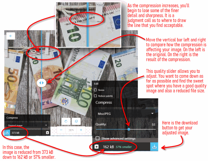
Now let’s compare the two images visually. (Because the image is wider than I can show in this blog post, I took a vertical slice to illustrate.) Below on the left is the higher quality original where the file size was 373 kB. On the right below, is the more compressed copy that is 57% smaller in file size at 162 kB. If you look very closely at the detail, you can see minor differences. But that is the point, you have to look very hard to even perceive it. The file size advantage outweighs the minor loss of detail.

Once you have an understanding of the various ways to optimize images, these couple of extra steps only take a few more minutes of your time but the result that you are producing has the mark of more professionalism. Your pages will load faster, your readers will have a better experience of non-laggy page loads and the search engines will be more pleased with your site as well! By understanding crop optimization, you will have more control over your pages and the images will not appear sloppy or haphazard but well thought out and complimentary to your textual content.