In this series of posts, we’re examining how you can raise the bar on the section of your blog post called the blog signature. This is your mini-bio that immediately follows every blog post that answers the question “who was it that just wrote this post?” Hopefully by an amazing post content, you just wowed them with your expertise. Now it is time to help funnel them into the next thing in your digital world by giving them a few choices to click on next, or even better yet, how they can call or email you to work with you!
Having someone call or email you… well, that takes some time and requires that you build your reputation score with them first. A well-formed signature will help you retain them in your court to aid in that process. The layout of a blog signature should be clean, simple, and give clear choices for possible next actions. We are visual beings and we enjoy seeing images. It attracts and focuses our eyes. A signature that is a wall of words with the 57 accreditations that you have is ultimately just eyeball no mans land.
So in this post, were going to concentrate on that visual aspect of your blog signature. As a reminder of the example blog signature that I have made for the use of this blog series, let’s review our final goal. Here’s Nick’s new blog signature to illustrate and give you ideas to form your own signature block.
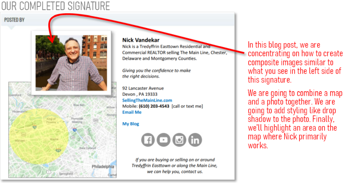
Do you see how using imagery draws the focus of the eye? You could simply put a single photo of you or of something that represents the area you work in. However, this post is to show you that you have tools within easy reach to take it to the next level by creating composite images. There are many different apps (or websites) where you can create composite images. I’m going to focus on two app choices that make this task extremely easy, and they are apps that you probably already have but haven’t considered their use for this solution!
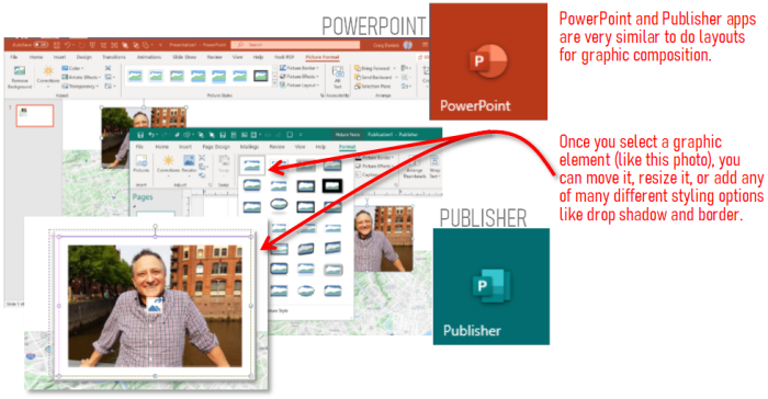
Are you a Microsoft Word or Excel user? If yes, then good news! Not because we’ll be using these apps for this task, but that probably means you have an Office 365 subscription or have purchased the Office Suite software. Word/Excel/Outlook are probably the more frequently used apps, but in the suite is also *Publisher and PowerPoint apps.
(*note: Publisher is not available in Mac version of Microsoft Office)
In this tutorial, I’m going to highlight these latter two apps. This is what I use in creating most of the composite graphics that you see on my blog. I actually prefer Publisher for this purpose as the tools are a little more oriented to page and graphic layout. However, if you are on a Mac and don’t have Publisher, you can accomplish the same results in PowerPoint in laying out your graphics composition. (note: earlier versions of Publisher were really not great, but with the 2016 version it took some seriously HUGE strides forward and so now it is a very capable layout app).
So let’s walk through some of the basic composition skills and tools in order to make what you see in our sample signature. The first step is usually to drag and drop all your image assets on the canvas/workspace. From there you can begin moving them around, resizing them to get a look that you like.
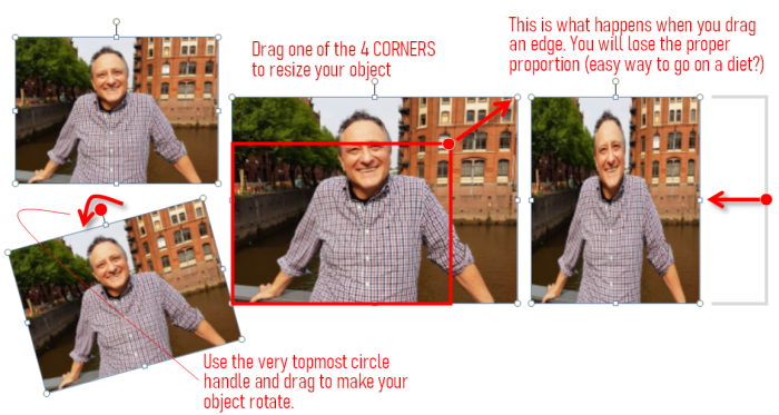
In the image above, you can see that resizing an image means clicking on one of the 4 CORNERS* and dragging inward or outward to make it smaller or larger. (*very important note: do not click and drag any of the points on the middle of the 4 edges to drag. This will change the proper proportion of the original and will stretch or squish things!) If you want to rotate an image, the handle at the very top of the image allows you to drag circularly to do a rotation.
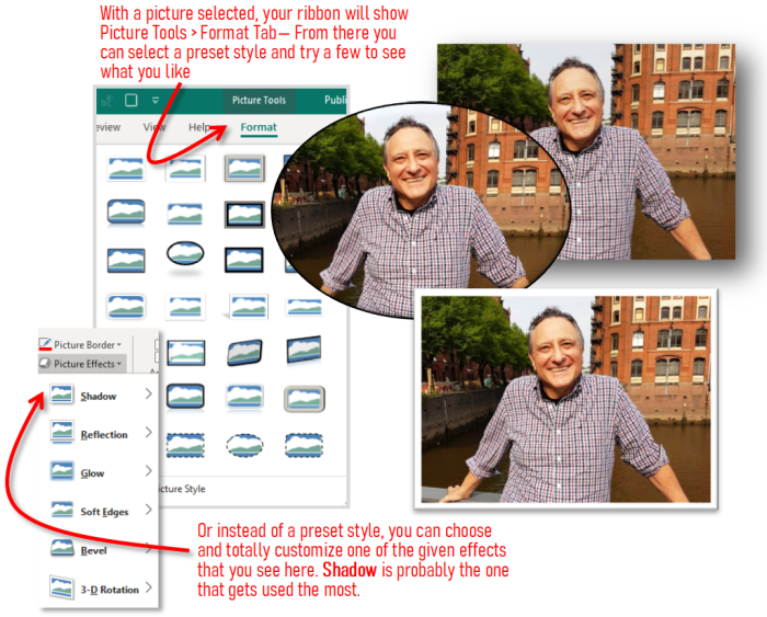
Not every picture needs to be “styled” but note in the illustration above some of the things that you are easily able to do. There are many preset styles that you can choose from and see if there are any that you like. This will apply a combination of shape cropping, border style, and shadow. A general rule of thumb in these kinds of cases is that the more subtle choices are the more professional looking ones!
The last step for this tutorial is to create a semi-transparent, yellow oval over Nick’s primary area on the map. In the drawing shapes pull down button you can see all kinds of shapes to choose from, we need an oval for the map. After you draw your shape, use the fill color selector on the top ribbon to choose your color. In this case, under the shape outline menu, you should choose “none” so you won’t have a hard line around the perimeter.
The last step is to set the transparency of the oval. If you select it, then right-click to get the pop-up menu, choose “Format AutoShape…” to get to the properties dialog box. In that box, notice that there is a transparency slider. You can pick a transparency level that works for you (and you may have to experiment a little to find the best setting).
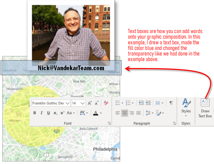
Your graphics compositions can also sometimes benefit by adding text as well. For illustration purposes, see the diagram below. In this sample, I drew a text box and added the email address inside the text box. Having email address as part of graphics is one strategy to avoid email address harvesting by spammers. Another other way you can help avoid getting your email added to spammer lists is to use contact forms for emails.
Wow! We’ve covered a lot in this lesson, but we are almost done!
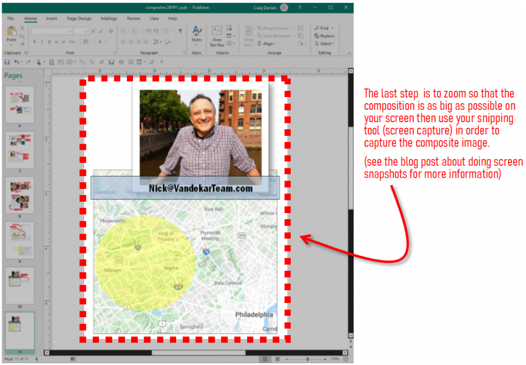
The last thing is to save your graphics composition to a file so that you can upload it into your blog signature. Graphics on web pages should be optimized for size in order to load as fast as possible, this next tip will help you create an optimal sized file. Zoom the graphic on the screen so that it fills the window, then use your screen snapshot skills to capture the image by drawing a capture window. (see this blog post if you need a refresher on doing screen snapshots)
Tip: It is possible that some of the text you typed has red squiggle underlines because the program does not recognize a word, but in fact it is a correct word. If it is not a mistake, you will not want the red squiggle line in your graphic. Right click on the word and either choose Ignore or Add to Dictionary and then the red squiggle line will disappear.